Pure Pom – building two brand territories for a Gen Z skincare launch
The job was not to make it look nice. I was asked to build a new Gen Z skincare brand from scratch in a saturated category – with an ownable territory, a scalable packaging system, and a brand that can win attention on shelf and on social.

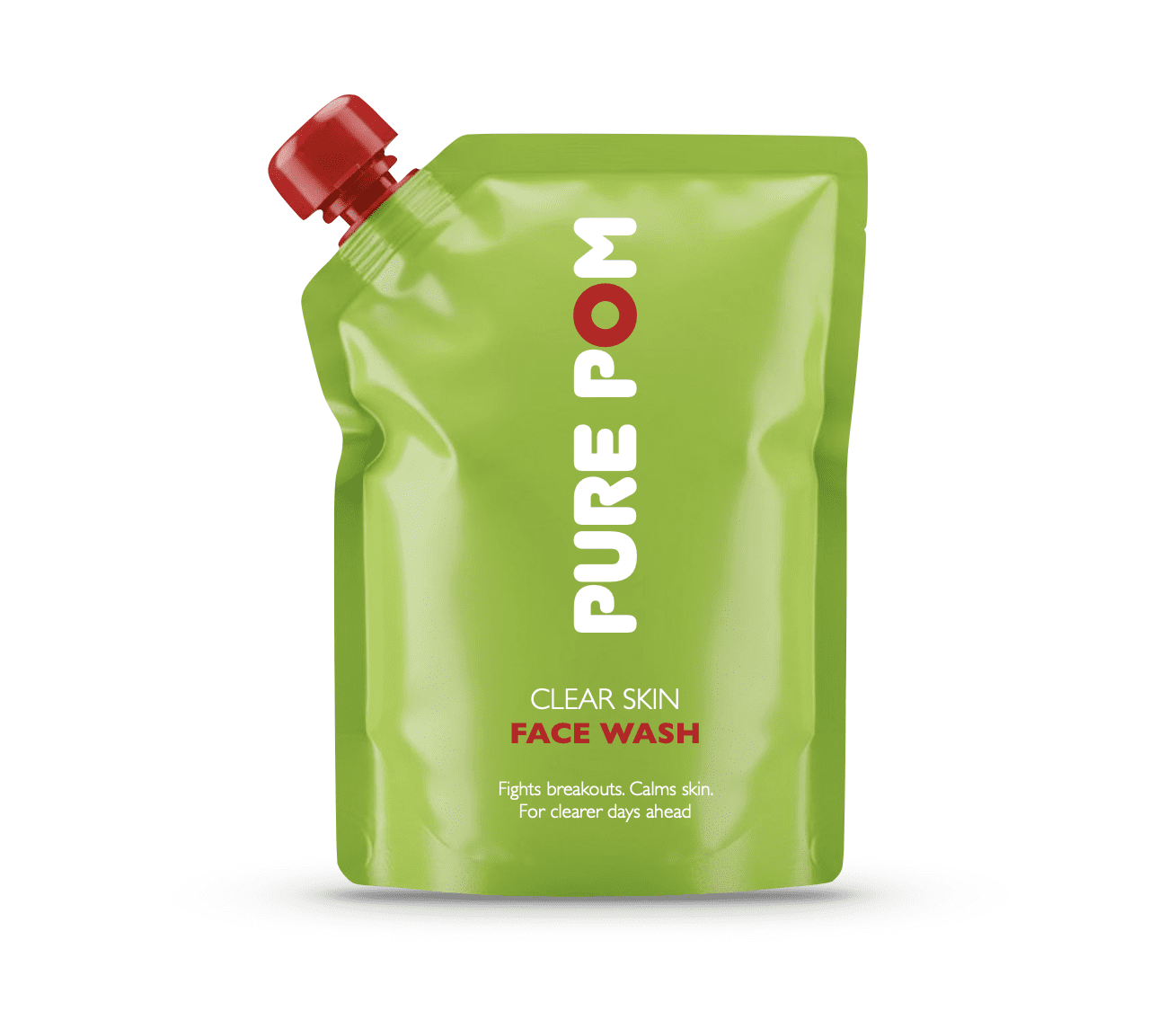
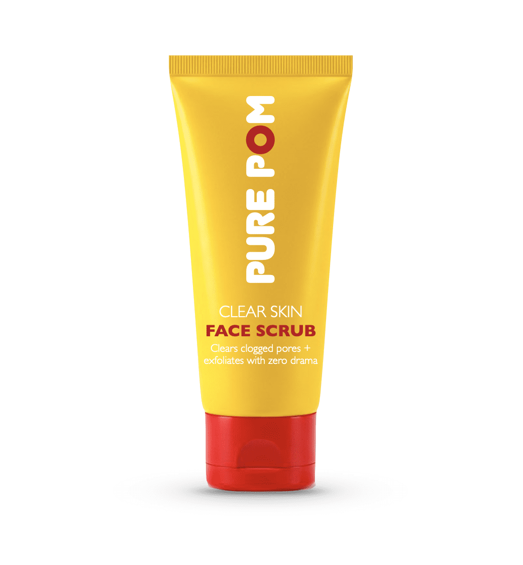
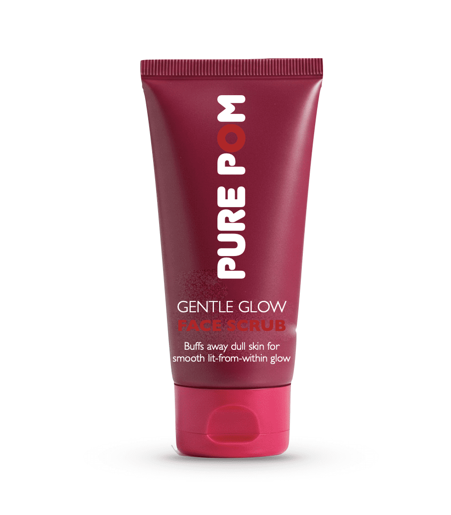
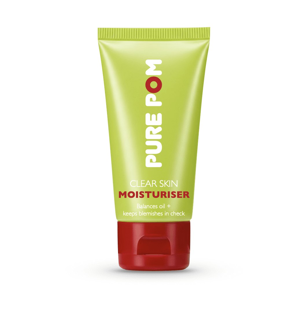
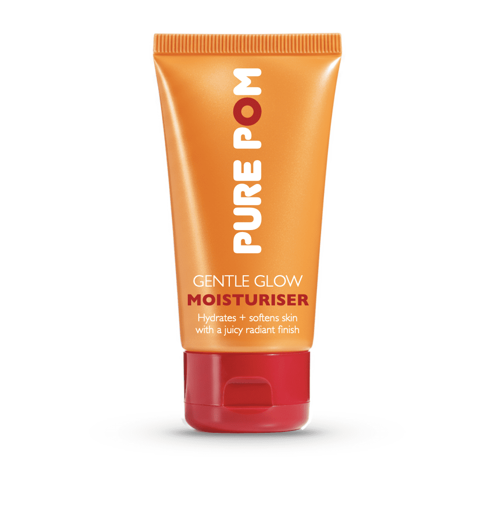
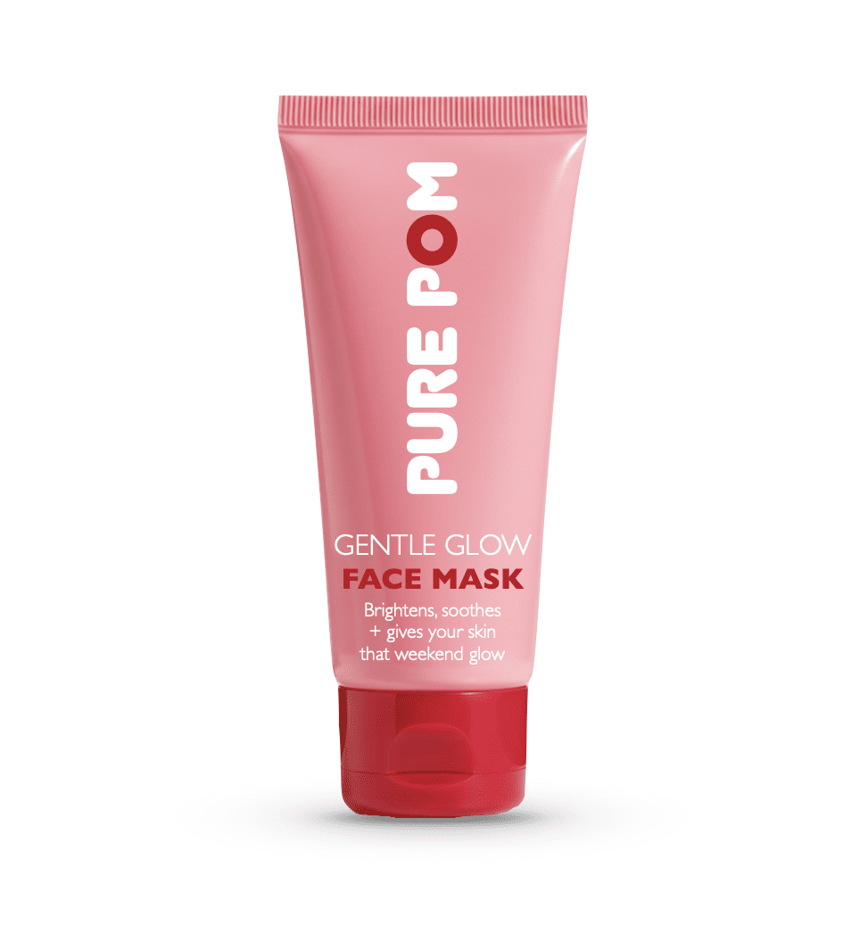
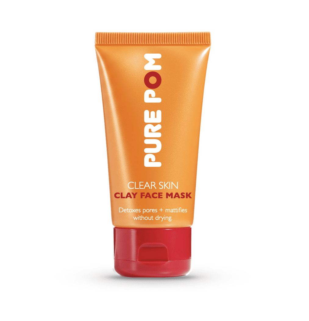
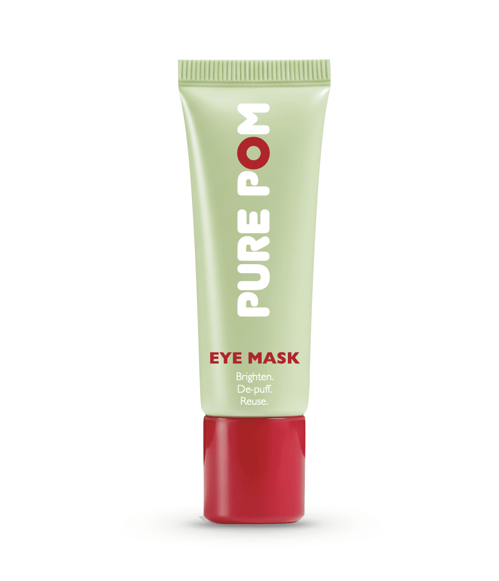
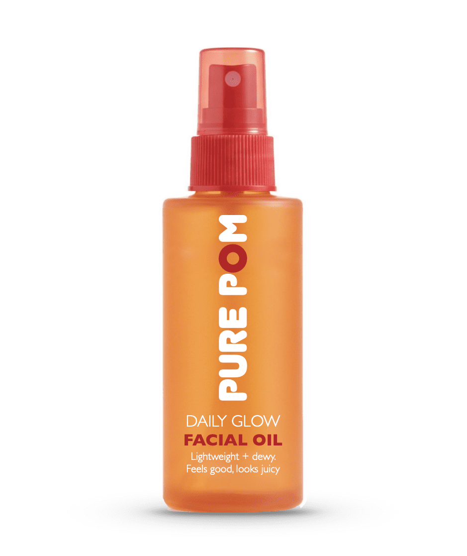
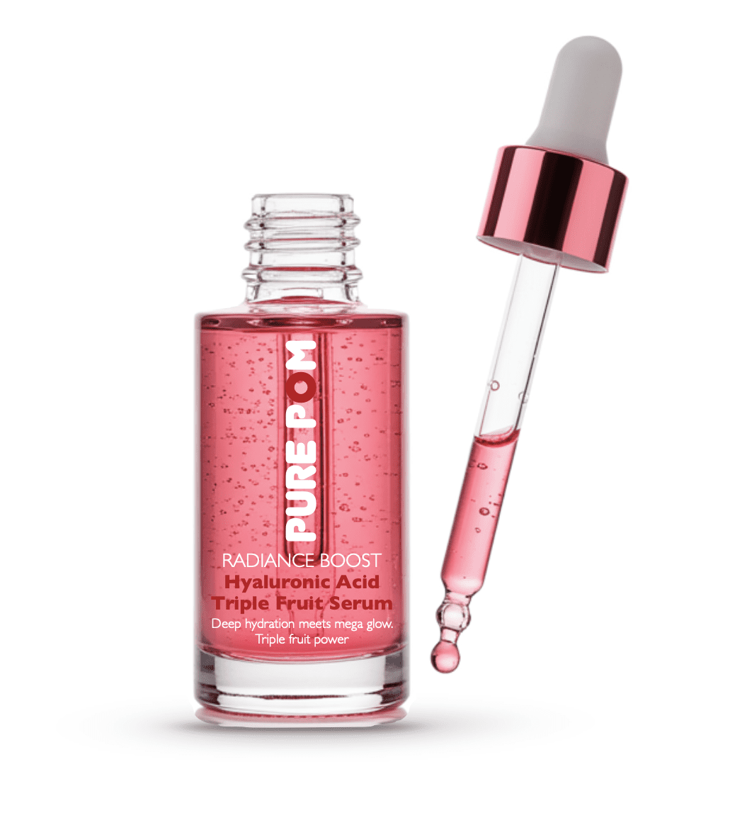
The packaging system
The system was designed to scale across a full range while staying instantly recognisable. Range colours help fast selection. The structure stays consistent across every SKU. The result is clarity, recognition, and shelf stand-out.

Brand line
The strapline treatment works as a fast brand mnemonic and keeps the tone upbeat without slipping into generic beauty language.
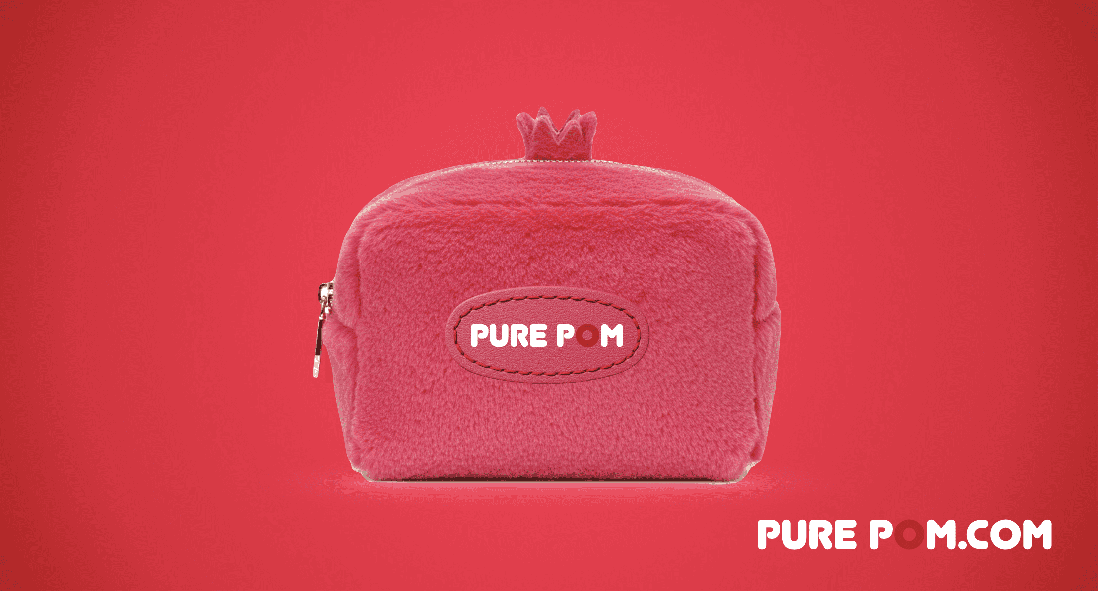
Applications
The system was designed to work beyond pack. Social avatar. Merch. Lifestyle touchpoints. Consistent recognition.
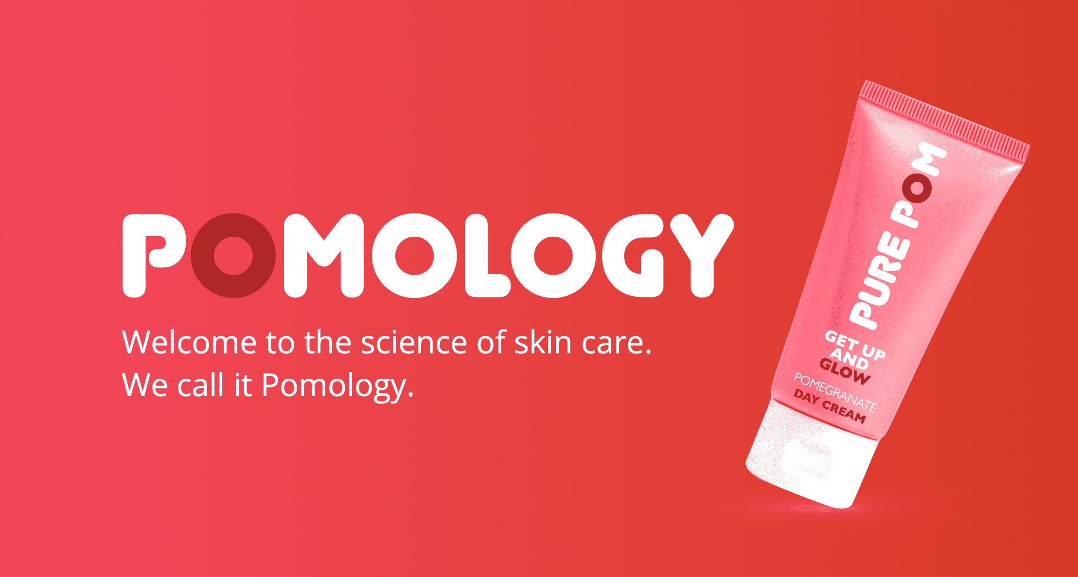
The BIG IDEA – Pomology
I developed the platform around Pomology – the science of skin, supercharged by pomegranate. It creates an ownable language that bridges natural energy with science-smart credibility.

Route B – culture-led badge identity (edgy option)
After the founder loved the retail system, they asked for an edgy option. Rather than tweak the existing design, I developed a second territory built around a bold badge mark – designed for cultural edge, community energy, and social avatar strength.


Why it exists
Route A is built for hierarchy discipline and scalable retail architecture. Route B is built for emblem recognition and cultural personality. Both serve different growth ambitions.
Outcome
An ownable platform (Pomology). A scalable packaging system. Refill integration. Two distinct brand territories aligned to different growth strategies.
The project is currently on hold, but the work remains a complete, launch-ready brand system. This case study is shared with permission.
Ready to build a brand system that owns a territory? Let’s talk.
This is a speculative concept created by Mip Phillips and is protected as original intellectual property. No part of this idea, including the visual execution, may be reproduced, adapted, or used commercially without my prior written consent. Any unauthorised use will be treated as a breach of my intellectual property rights. If you’d like to explore using it, please contact me first.