
01
MAKE IT DISTINCTIVE
A sharper visual identity, confident typography and outdoors-led green palette created a much more ownable presence in the category.
Brisks needed more than a fresher logo. The brand needed to feel as modern, capable and forward-thinking as the business behind it.
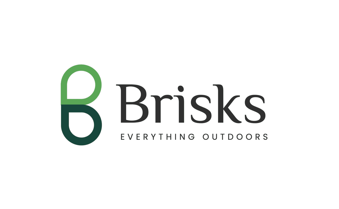
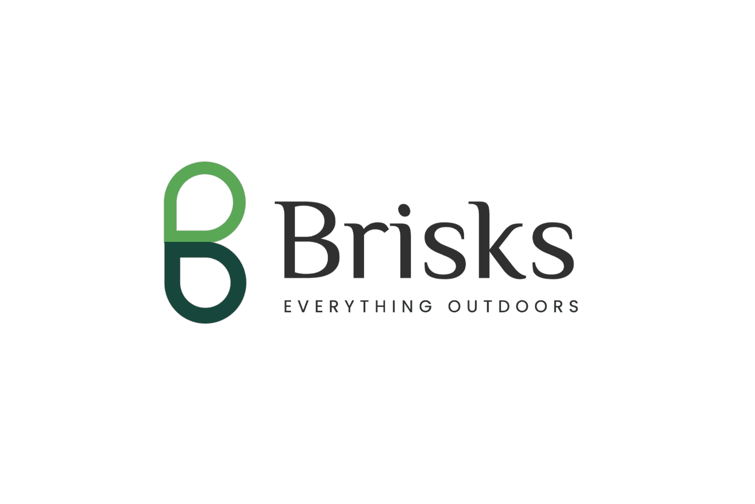
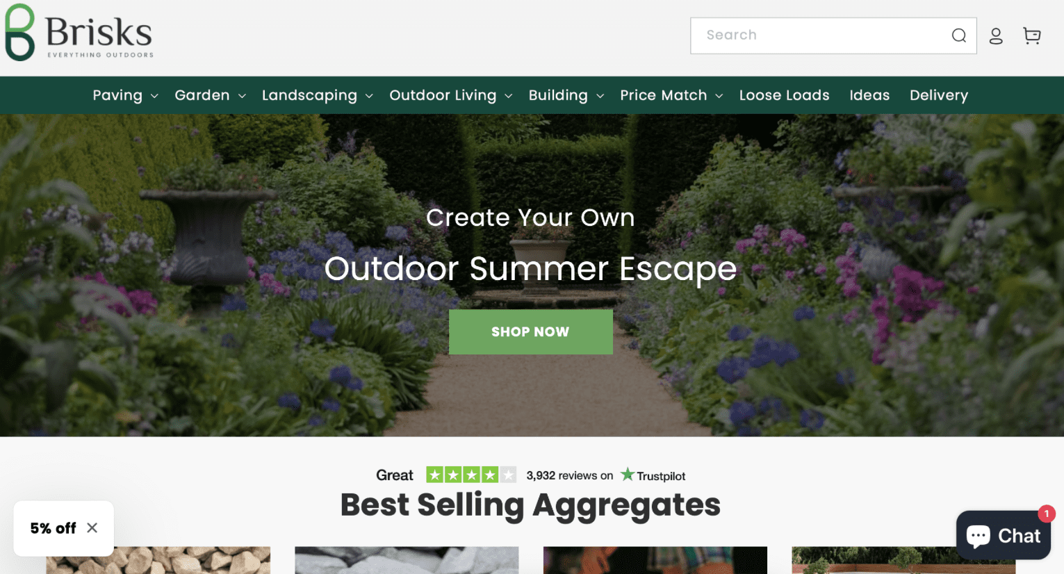
I created the full rebrand – logo, identity system, website styling and a BIG IDEA that turns the letter B into two directional communication devices designed to guide attention and action.
Brisks supplies aggregates nationwide with 48-hour delivery to local authorities, schools, construction sites and the public.
The business had scale, capability and ambition, but the brand did not reflect any of it. It felt dated and generic in a practical category where clarity and trust matter.
The rebrand needed to modernise perception, make the offer easier to navigate and give the business a distinctive identity that could work consistently across every touchpoint.
The Brisks B was developed as more than a logo mark. Its two directional forms become communication devices that can point to offers, messages, products and next steps throughout the brand system.
The strongest identities are not just recognisable. They help people understand where to look, what matters and what to do next.
A sharper visual identity, confident typography and outdoors-led green palette created a much more ownable presence in the category.
The B device became a practical part of the communication system, helping highlight offers, products and next actions.
The identity was designed to work across logo, website, business cards, campaign assets and future brand communications without losing consistency.
The brand system connects identity, web and communications so Brisks feels like the same business wherever a customer encounters it.


Clarified how Brisks should present itself as a modern national supplier.
Created the new logo, visual language and distinctive B device.
Turned the B into two directional communication devices used to guide attention and action.
Applied the system across website styling, business cards and wider brand communications.
If the business has moved on but the brand has not, bring me what you have. We can work out what needs changing – from positioning and identity to the whole system.